

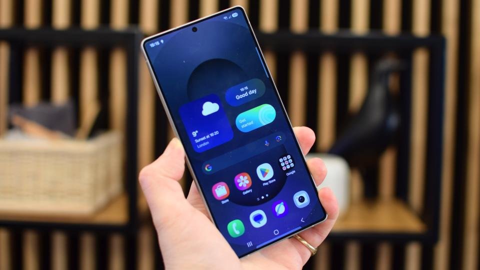
Although Samsung mocked iOS 26's “Liquid Glass” design, it appears the company has no intention of staying away from these trends. The company continues its efforts to make the user interface more modern and visually appealing. These steps can be seen as part of a strategy to improve user experience in a market where competition for mobile devices is particularly high.
The editorial office reports that Samsung has updated its Theme Park app, introducing new “Glass” icon effects. This innovation allows users to customize their device's interface in a more personalized way. The “Glass” effects add transparency and a modern visual appearance to icons, resembling iOS's “Liquid Glass” design. This move indicates changes in Samsung's design approach and the company's efforts to adapt to market competition.
This innovation is aimed at providing a richer visual experience to users within Samsung's ecosystem. With such innovations, the company aims to increase user enjoyment of their devices and enhance brand loyalty. This is also a step taken by Samsung to differentiate its products compared to its competitors.
In conclusion, Samsung's addition of "Glass" icon effects to the Theme Park app is an example of the company's efforts to adapt to design trends and enrich the user experience. This is part of Samsung's strategy to increase its competitive strength in the mobile device market.
Farid Alizade